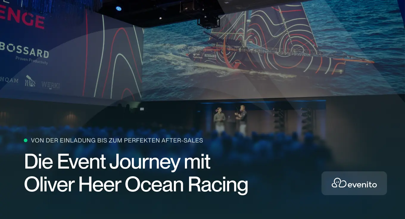
How your event is digitally convincing even before the first guest arrives
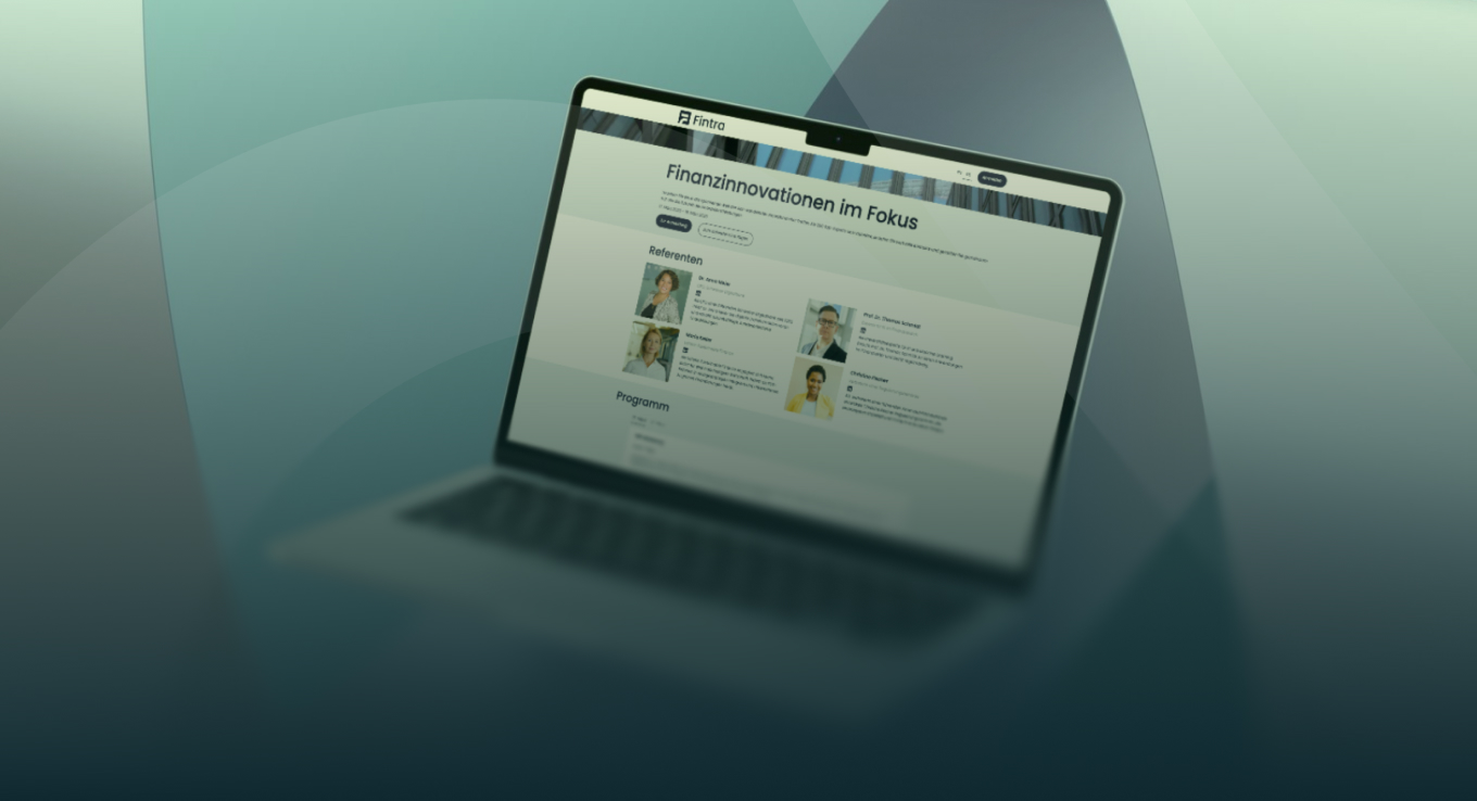
Your event website is much more than a beautiful landing page. It is the central hub for communications, registry and guest management. Even before guests open an invitation or arrive on site, the website decides whether your event looks professional and well organized.
Especially for complex business events, it is worthwhile to work particularly carefully here. These tips will help you design event websites that not only look great but also work.
1. Think from the point of view, not from the design
Before you choose colors, images, or layouts, answer a simple question: What should the website do? Should it generate logins? Set up an exclusive event? Or explain a complex agenda in an understandable way?
A clear goal helps you prioritize content and omit anything superfluous. Good event websites are not to the fullest, but have a conscious focus.
2. Less text, more orientation
Visitors don't read event websites, they scan them. Clear headlines, short paragraphs, and logically structured areas are crucial.
Focus on the essentials:
- What is the event?
- Who is it for?
- When and where does it take place?
- How can I sign up?
In-depth content such as travel information or detailed speaker profiles belongs on sub-pages and not on the homepage.
3. Mobile first is a must
Most visitors first see your event website on their smartphone. If mobile navigation, texts, or buttons don't work, you'll lose them immediately. Pay attention to easy-to-read font sizes, short load times and clear call-to-actions that can be easily clicked even with the thumb.
4. Show an attitude with consistent branding
Your event website should feel like a natural extension of your brand. Colors, fonts, imagery and tonality must go together and ideally be repeated across all events. Consistency creates trust. And trust is the basis of every registration.
5. Clear calls to action instead of confusion
One page, one main goal. Whether it's “Register Now,” “Save the Date,” or “Add to the Waitlist,” make it clear what the next step is. Too many call-to-actions make you feel anxious and slow down decisions. A well-placed, clearly formulated button often provides more than five options.
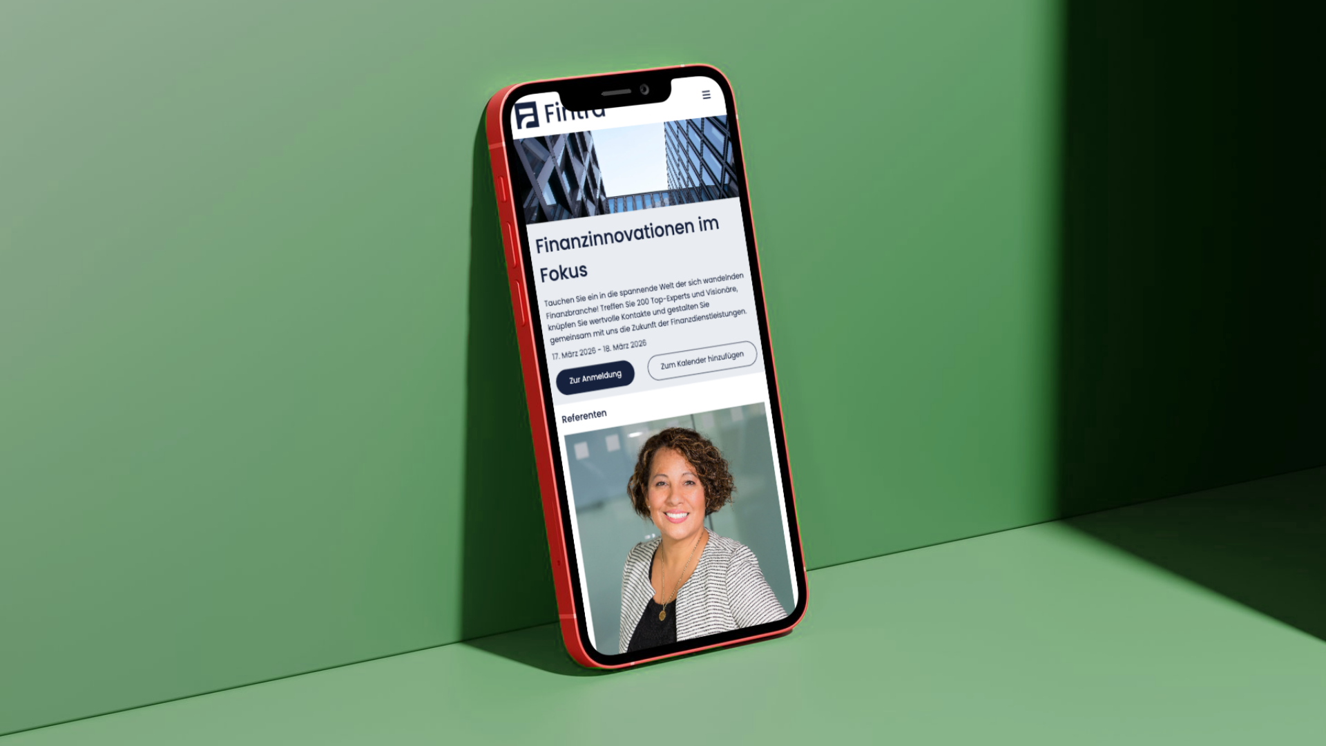
6. Images that raise expectations
Strong visuals convey emotions and give your event a face. Use pictures of the venue, previous events, or speakers, but only if they are of quality and match the event. Important: Images should support, not distract. And they need to charge quickly.
7. Include accessibility
A good event website is accessible to everyone. Clear contrasts, clean heading structures, descriptive link texts and alternative texts for images not only improve accessibility, but also overall user navigation.
8. Test before your website goes live
Broken links, typos or incorrectly displayed content cost trust. Test your website internally on various devices and get feedback from colleagues before it's public.
Conclusion:
A good event website It doesn't happen by accident. It is clear, reduced, mobile-friendly and consistently geared to your event goal. When design, content, and technology work together, it becomes a real success factor for you and your guests. With evenito, event websites can be implemented in exactly the same way: centrally controlled, flexibly structured and perfectly embedded in the entire event process. Because a good event starts long before check-in: online.
.svg)